Wednesday, July 25, 2012

Figure


Figure Painting


These photos below are painted by sumi ink all of it are 10 minutes painting. I mixed ink with the water to make it brighter for making the shadow. 


Figure Drawing

This picture is a blind contour drawing of a women.


This one is a 10 minutes drawing


Anatomical


Unarmored Body Painting


 For this painting, I got inspired by Lady gaga's dress for Grammy Awards. First I transfer my favorite figure drawing into a drawing paper and then I started draw a circles around the body. I decided to paint many colors on the line and the black are painted as a background.


Lady Gaga 's dress


Logo+Poster Design

LOGO DESIGN
     This is my final logo

Basically CAM-B is stand for camera and bracelet. Me and my partner (Clara) made logo that look like people dancing. We made the shape below the letter to have a sharp so this will make the logo look more interesting.


These are my drafts of the logo


POSTER DESIGN

My final poster

 We put the logo on the top left of the poster and made it large enough for everybody to see it. We also made the background which has 3 circles with different color.


Friday, July 20, 2012

Product statement

Bracelet/Cam-B


Clara and I made a bracelet that have three small cameras on the back. People can overturn the circles on the bracelet and then they can use the cameras to take photos. The bracelet is pink and have many small colorful 'dancing people' patterns on the top and the bottom. 


Because our events are about concert and birthday party, so we decide to design a bracelet that have cameras on it in order to let people record the important moments. Also, for our events are about happy and happiness, so we made the key color of the bracelet pink and draw so many colorful patterns on it to show the mood.


This bracelet is design for everyone. We believe that people want to record many important, valuable moments that happen in the important occasions. However, they are tired of to take out the big cameras. Because the big cameras are inconvenience to carry. So that is why we created this bracelet! It is small, convenience and beautiful. People can wear it to the parties and take photos whenever, wherever they want. They can talking to their friends while they are taking the photos. They even can drink and eat at the same time! We consider that the bracelet is so useful for everyone who attend concerts and parties. 


Monday, July 16, 2012

DESIGN REVIEW


VERSACE


This garment is absolutely fabulous, they use bright colors and made it into the pattern in this garment which is very interesting for me.

I love that they using bright blue and yellow colors and make it into the curve patterns in the middle of the garment. And also I love the skirt which is patterned and see through.

THE PROCESSES

THE PROCESSES


I didn't took many photos during making processes.


This is the top


This photo is when I'm start doing pants


This is when I'm start painting the wings.


This is my mood board


THE MET

The armors...


Prada and Schiaparelli


Garment

GARMENT DESIGN


THE WINGS


INTENTION:
My intention was to make this garment related with my event which is concert(Lady Gaga concert). This garment has 3 colors on it which are dark blue,orange and green. I use the bright colors to make it looks that we're in the concert.

SUCCESS/EDIT:
EDIT: I can see the tiny white that wasn't painted on so, I need to redo it and make the garment cleaner.
SUCCESS: The most successful in the garment is the pant because I painted the pant with the dark blue but I add some wings on the both sides of the pants so it look more interesting.


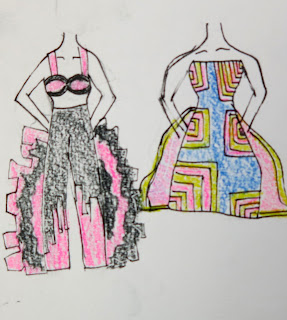
 These are my draft design of the garment


Sunday, July 15, 2012

IMPOSSIBLE CONVERSATION

I would love to have an impossible conversation with GERARD STRICHER


I  love his works a lot, it's look so lively,playful and so abstract. His works are kind of randomly smear and drip colors into the paint. However, it still look good and look impeccable because of the composition of the colors.In my opinion his works can tell feeling by, the way he puts color on his works.


               His works influenced me to paint an abstract paintings more amuser and creative and it makes me 
to have more confident.


Thursday, July 12, 2012

Design book cover

Book cover
This is my final


This is the book cover that I made it as a final piece. I used the photo that I took as a background and then I adjusted the color of the background to make it more brighter. For the font, I extended some part of it to make it looks like the light from the concert.When you think about the concert, the first came to my mind is the light so this is why I made a light photo as a background.


 Then I tried to put the background which is the photo that I took


Grey scale and Color Wheel

BW/Color palette
                                                                         Josef Albers


Grey Scale


12 hue color


Monochromatic


Complement


Analogous


4 Perfect color palette


Abstract Word

Design
My event is concert, so I chose word 'Lively'


This is my final

This is the painting on canvas.The concept of this painting piece is using black and white color to represent the word that relate to my project. So I started creating my ideas on the sketch book(as you can see below) and I made the curve line so that can show the word lively also I spit it into 3 parts, in the middle I painted the background as a white color while the foreground of the painting is painted in black. For the background between the middle one are painted in black but the foreground are painting in white.So this will make the painting look more livelier.

The draft